React UI Library
React UI Library
Due to the popularity of React, many UI libraries have been developed to improve the front-end experience of the App.
Most popular UI libraries include:
1. Material-UI:
Material-UI is an open-source project built on google material design. It started in 2014 and has come out to be one of the best UI libraries for React. We will go through this library in this tutorial.
2. Shards React:
Shard react is a high-quality UI kit with a modern design system with many custom components. It has the high-speed performance.
Installation
Install shards via the command line:
npm install shard-react
3. React Bootstrap:
React Bootstrap implements its components with Bootstrap, a widely popular CSS framework. It is compatible with many browser versions and has little dependencies on jQuery, Javascript, etc’
Installation
in your command-line:
npm install react-bootstrap
4. Semantic UI React:
One of the best UI libraries out there, it is jQuery-free, augmented, and has a declarative API
5. Onsen UI:
Based on hybrid designs that make your web app feel like a mobile app, it is designed to give users the experience of a mobile app. Can also be integrated for React Native and iOS.
Installation
Get started with the command :
npm install react-onsenui –save
6. Reactstrap
7. Grommet :
Especially good for charts, and tables. It has a large component for powerful themes
Installation
Use the command:
npm install grommet
8. Elemental UI:
A UI kit for React websites and apps with a large number of icons, themes, and layout designs
Installation
npm install elemental –save
Material-UI - Example
This tutorial will give a walkthrough on how to use one of the library components, the Material UI library.
Introducing Material UI
Material-UI makes React component set-up faster and easy for web development. An exceptional part of Material-UI is its wide library of icons- consisting of over 1000 icons, which allows the inclusion of icons into our components very easy.
To get started we need to install Material-UI’s core.
Installing Material UI
Install Material-UI via npm:
PS C:\Users\HP\react\react-project>npm install @material-ui/core
Wait for the configuration set-up, then let.s take a look into the usage.
Using Material-UI
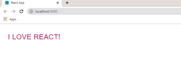
In App.js:
import React from "react";
import { Button } from "@material-ui/core";

function App() {
  return <Button color="secondary">I love React!</Button>;
}

export default App
Result:

Notice the color attribute and the wave-like transition when the button is clicked.
import React from "react";
import { Button } from "@material-ui/core";

function App() {
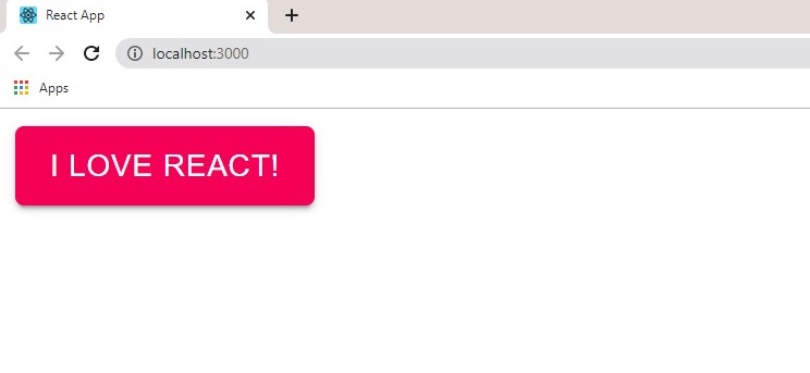
  return <Button variant='contained' color="secondary">I love React!</Button>;
}

export default App
Result:

Material-UI is designed with mobile responsiveness in mind, to ensure proper rendering , input the following command in the <head> tag of the html file:
<meta name="viewport" content="width=device-width, initial-scale=1" />
See the official docs on the full usage here.

